G’Day Casino gets a new and improved look with interface update
Aussies like new things, so it’s no doubt we are excited to find out that G’day online casino, which is targeted at Australian players has revamped its instant play interface.
The Internet gaming establishment has always offered an instant play platform only, meaning it operates via your browser with no downloads required. Therefore you don’t need to download the casino in order to see their entire catalogue, something which is very Mac-friendly (Mac users can’t access downloadable casinos). They’ve stuck with this feature, changing a few aspects that makes navigation and game play smoother and easier, which we will cover.
New updates to instant play interface
 For those of you who don’t know what the interface of an online casino is it, is basically the software used to communicate to the viewer what the communicator is aiming to share, and in this case it is what the online operators want to offer to their clients.
In other words, the interface is what you see when you go to the online casino via your preferred Web browser or in an external window if you have downloaded official software.
By upgrading this interface, G’day is improving what they are communicating in order to make it easier for players to both navigate games and other areas of the site, as well as have the whole experience run smoother. There are quite a few updates to the browser interface which may not be noticed instantly, but on second glance are quite obvious and actually quite helpful.
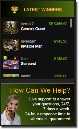
Latest winners list – On the left hand side of the interface (when viewing on our screen) there is now a scrolling list of the latest winners, which runs 24 hours a day seven days a week. Featuring the user name, what game they won on, and how much prize money they won (though it is in euros as opposed to AUD). This is a good indicator that G’day casino games are fair and that wins are quite regular. It also is a good way to work out which games have seen the biggest wins for players so you too can have a go, and works similar to the player lists implemented by rival Royal Vegas for their recent site-wide casino heists promo.
You can also scroll up and down the list, especially to see if you have made it after a win so you can screen shot it as personal memorabilia, especially if it is a big win. We also like this feature because the games which other players have won on are linked in the list so you can click on them and be instantly taken to the title.
 Jackpot total – The jackpot total used to be listed on the left hand side (once again the side when looking at the screen) and it was the total amount of all jackpot games combined. This total can still be viewed, but it is located at the top of the interface.
But what about if you want to know the individual jackpot totals for each game, rather than the total of all so you can make an informed choice of which title to play? G’Day now has that option, with the total of each game appearing intermittently the same way as advertisements do on those ever changing signs we see around shopping centres. So every few seconds the game titles change to the next game which offers both the total amount that jackpot game offers and a link to easily access the game.
You can also scroll back and forth through these titles to find a specific one or to just speed the process up. Progressives include Hall of Gods (which is currently over $8 million at the time of writing), Arabian Nights and more.
Quick access to customer service – While customer support has always been fairly simple to find with their menu panel featuring a link called ‘Support’, it hasn’t ever been as clear as to what they are offering in regards to support. Underneath the latest winners list there is an image which will take you to the same support page if you click on it. However, the image states that the support is live and available 24/7 to help, which makes it a lot clearer as to what the support link is and when it is available. This means there are now two quick links available on the homepage interface which can be quickly accessed while you scroll through games.
Quick links to their Facebook page – One of G’day casino’s latest promotions involves checking their Facebook page, and to make it that much easier for you the online operators have included a link on the right hand side, near the scrolling bar, which takes you straight to their Facebook page. Their Facebook is not only imperative to follow for their specific Facebook promotion, but it also details the latest games, new promotions, day specific bonuses, and more. Simply like the page to have it appear regularly on your newsfeed to keep up to date with all things G’day casino.
New mobile interface
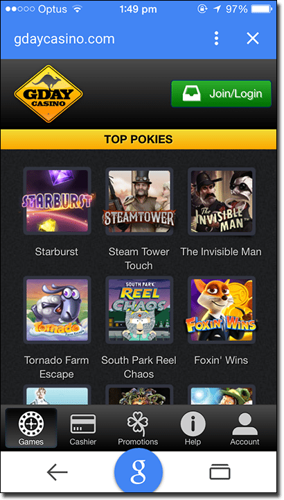
 G’Day online casino has had a mobile-friendly version for a longtime now which you can access on your smartphone or tablet, but the interface hasn’t been all that user friendly. It has recently updated to include a panel of icons located down the bottom of the screen to make playing on our mobile device a lot easier. Originally these were in the square icon which when tapped on would reveal a drop down menu and were located up the top above where the ‘register’ and ‘login’ links were which were coloured bright orange (these have been combined to one small green link at the top right hand corner).
This panel is a lot more mobile-user friendly and features a games icon, a cashier icon, a promotions icon, a help icon, and an account icon. Simply tap on any of these icons and the interface will literally slide to whatever screen you are after. While the games layout is still similar, with a bit of scrolling involved, this new interface with the menu panel is a lot easier in terms of navigation, making gameplay on portable devices a lot easier.
